
How to explain complex machine learning topics
Why it's so incredible important not only for explaining scientific concepts, but also for everyday communication

These past few weeks have been a lot of document review and authoring for me at Google. I’ve spent a lot of time writing, editing, clarifying, and revising and one thing has stuck out to me above others: The best way to explain technical concepts is to show them instead of telling them.
For those of you who don’t know, Google takes a document-driven approach to software design. This means the plans for a software system are written in a document detailing the problem it solves, why it’s important, and how it’ll be implemented. This allows the document to be share asynchronously and however widely it’s necessary to get the right feedback on it. More on that in this article:

This process is incredibly effective at what it’s meant to achieve, but the asynchronous nature and the approval-driven process mean projects can be stuck in document review for a long time. If an author isn’t incredibly clear and thorough in their explanations, there are many questions that will need to be answered before a project can be started.
This means projects can fall into a sort of document purgatory: Slow reviews combined with ambiguity means progress doesn’t move at all.
This purgatory has taught me two things:
Just how ambiguous technical explanations can be. There have been a lot of questions I’ve assumed I answered but I didn’t.
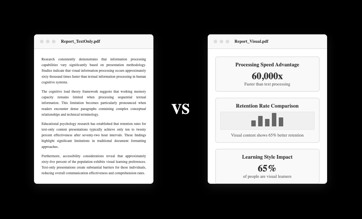
Data, charts, code snippets, and other visual aids are much more effective at communicating than words. Documents that prioritize these get reviewed faster and have far less ambiguity. These are the projects that get off the ground running and have the largest business impact.
I’ve heard the mantra “Show, don’t tell” before, but it had always been in reference to articles or presentations—it isn’t something I had thought of as an asset when communicating with my coworkers. When I realized this it got me thinking: When is “Show, don’t tell” not applicable? The answer I came up with is almost never.
This is why we see generative AI explain things in metaphors (not always accurate, but still), authors begin chapters with anecdotes, and the most effective reporters share data, charts, and graphics to support their claims.
One of my goals for Machine Learning for Software Engineers is to be better about showing you all concepts instead of just explaining them. The beautiful thing about software engineering is we have so many ways to communicate effectively. We’ve got code, charts (or anything visualizing data, really), block diagrams, and even demoes to communicate the value or work.
I want to get better at this because I want these articles to be more helpful to you, but also because there are numerous benefits to becoming a better communicator. Better communicators make more of an impact on projects and tend to be more successful in their career.
So I challenge all of you to get better at showing instead of telling with me. In the next section, I’ll use some examples to show you how.
How can I show instead of tell?
I’m going to show you what showing instead of telling means by sharing the work of some of my favorite authors here on Substack. These authors do an excellent job of sharing ideas visually and showing their audience the importance of their topic.
is one of the best examples of showing instead of telling. uses data, images, social media snippets, and (most importantly) memes to relate his ideas and teach concepts to his readers. His unique style of showing is what’s gained him his large readership.His most recent article is an excellent example of this, you should check it out:

Another excellent example of showing versus telling is
. does an excellent job of breaking complex mathematical machine learning topics into visuals to explain them clearly.I suggest all software engineers getting into ML/AI check The Palindrome out. Most software engineers strongly dislike math but it’s important to know for machine learning.
An excellent example of Tivadar showing instead of telling concepts is in his article on graphs and matrices:
’s Substack, , uses visuals to show the important takeaways from ML papers. He uses powerpoint to create visuals by pulling the visuals the author has created directly from the paper and contextualizing them.
All of his articles are great examples of this, but one I think is particularly important to my audience is his most recent write-up on Llama 4:

Lastly, I’ll include a post of mine that I want to do more of and I think software engineers will especially useful. I break down how to train a model using Apple’s MLX with code examples, explained step-by-step.
This was sent out to subscribers of
last year and the code is also included in the ML for SWES repo if you want to give it a spin yourself right now:Why MLX is Important for the ML Community

MLX is a lot bigger deal for the machine learning community than most people think. Let’s understand what it is and what it means, and let’s even get it up-and-running on your Mac.
Hopefully the importance of showing versus telling has been shown clearly. My goal is to show you more and tell you less in the coming articles. You should try doing it too!
If you’ve got a complex technical ML explanation that is particularly good at showing, drop it in the comments or hit me up. I’d love to run through it and share it.
Always be (machine) learning,
Logan